Image 1: Extreme Close-Up (0.05″ Square)
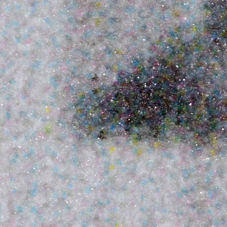
On the print, you can see:
• Light light black ink (LLK)
• Light black ink (LK)
• Black ink (K)
• Light cyan ink (LC)
• Light magenta ink (LM)
This image is print using professional printing software (RIP), using a black and white image set to “Neutral.”
Image 2: Zoomed-Out (1/4″ Square)
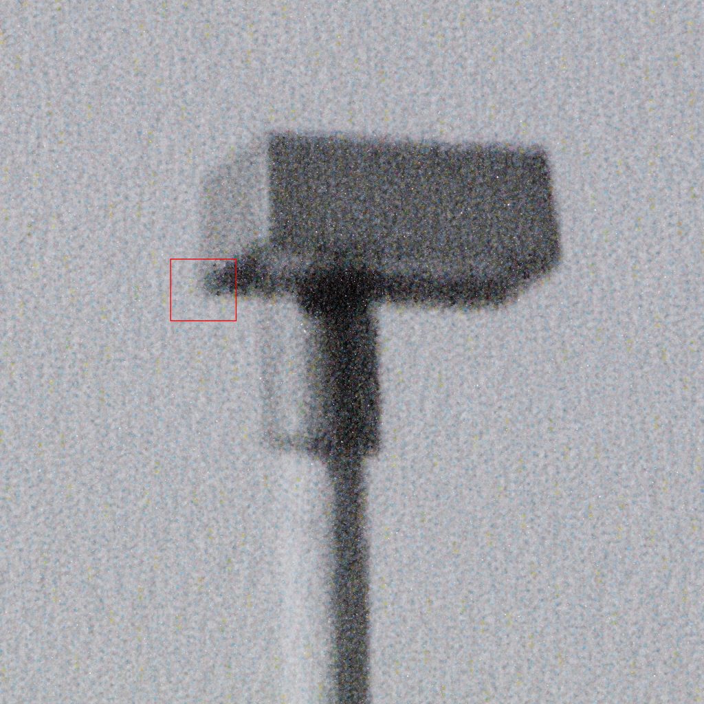
- LLK is very diluted so it’s edges are indistinct, and it blends in, but it is the primary ink here
- LC has more distinct edges and is about 1/3 as prevalent as the LLK, but still that is a lot of color in a Neutral tone!
- LM is also very dilute and less distinct, but also seems to be about 1/3
- The Yellow ink dots stand out more, but there are far fewer of them
The light tone areas of this image are mostly LLK, with even mixes of LC and LM, with some Y in there too. There might be other dark inks in the darker areas, in addition to black, but it’s hard to see. The black ink is very effective at making a rich, solid black area.
Image 3: Test Strips with Color Tints
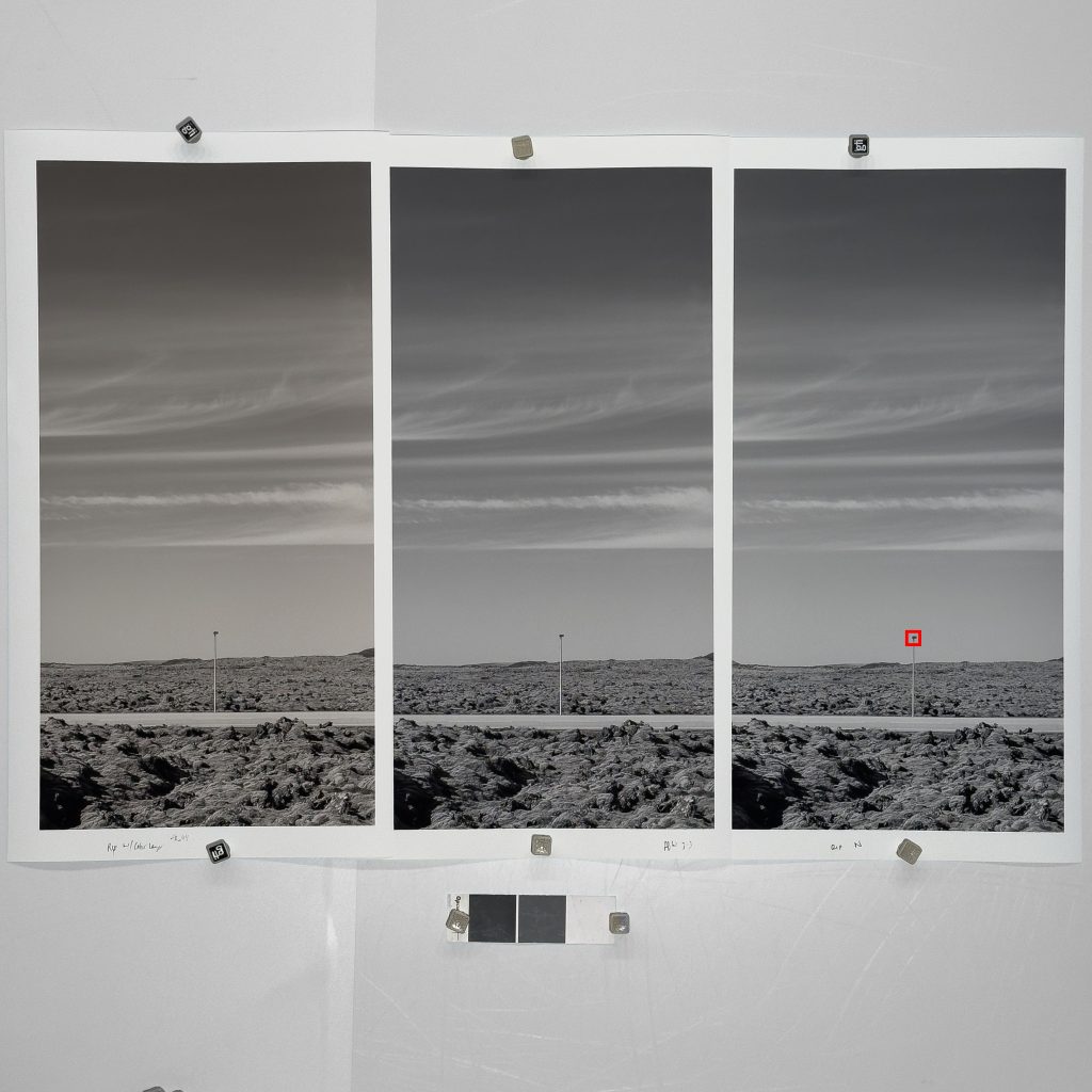
- The Left test is a B&W image with a color tint added—four yellow, one red—which felt right for this image. It’s a little warmer than we normally print black and white images.
- The middle image was printed through Epson’s driver in advanced black and white mode, with a slight tint added. It’s not much different than the neutral print out of the Professional print software.
- Regardless of attempts to remove color inks, there are always color inks present when printing neutral or slightly tinted black and white prints. Overriding to use only black and white inks does not produce good results, so we stick with the normal process.
Image 4: Digital File Comparison

Image 5: Pixel-Level Zoom

Summary:
This series demonstrates how different inks and printing processes affect the appearance of black and white images, both in extreme close-up and at more typical viewing distances, as well as how digital files compare to physical prints at the pixel and ink-dot level.