Lightroom Classic (LR) is an excellent tool for editing photos. But Lightroom does not know if you intend to publish your images to digital platforms or make a large exhibit print for display in real life. With every Lightroom Classic update, the need for Photoshop edits decreases, and many of you can prepare your files for printing large solely in Lightroom Classic.
Watch out, though, some of the LR settings can create problems in a printed image! This tutorial will show what you should pay special attention to when editing for printing large. Thankfully, Lightroom settings are non-destructive, so you can always go back and change settings at a later time.
PROFILE and WHITE BALANCE:
The profile setting is easily missed and likely one of the most important settings that all the other settings will build onto. Try this experiment to start; we will try to get the most technically accurate rendering as possible to provide a base reference. After we evaluate this rendering we can make a more informed choice on what effects we need to achieve our vision. In my mind this is like setting all the controls to 0, evaluating what I have then deciding what I want to do with contrast, saturation, and balance.
The best profile for accuracy is “Camera Faithful” or “Camera Neutral”. The Adobe profiles don’t take into account the specific camera, but it’s easier for Adobe to present their profile as a default. You may need to go through a step of loading the camera manufacturer’s profile the first time you install LR.
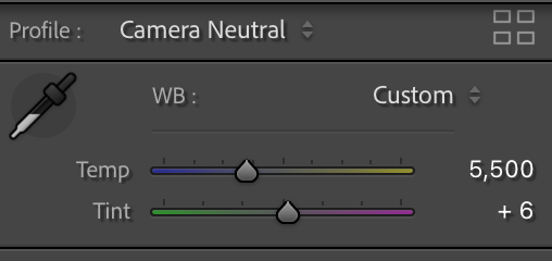
The color temperature setting usually defaults to an auto balance setting from the camera. This setting can work pretty well, especially in difficult lighting situations. But I prefer to set the default to a neutral daylight setting (5500˚K w/tint 6), you will need to tweak this to your camera and lens combo. My reasoning is personal on this one. I like to see what color light the camera saw, before I make a judgment on what color to present the image at. Unlike our eyes/brain, your camera has a fantastic ability to see color as it is; why not take advantage of that?
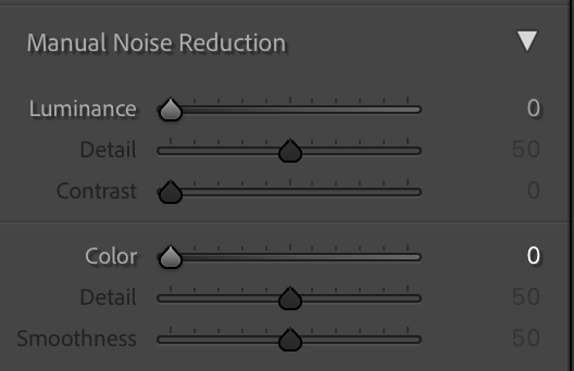
NOISE REDUCTION:
The default needs to be adjusted for your image; don’t accept a default setting. Manually adjust this setting based on your ISO or the noise you see in the image at magnification. Noise reduction blurs color and details, so use only as much noise reduction as you absolutely need for optimal sharpness. However, it may help soften skin in portraiture. I’m not sure if this is the best tool for that.
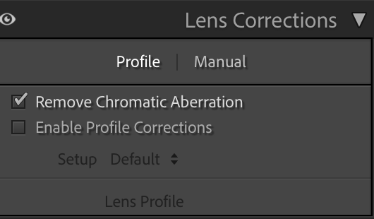
LENS CORRECTION:
“Remove Chromatic Aberration” is valuable, and should be checked except for macro photos. Not checking this box and having chromatic aberrations in the print is one of the most common errors that I see with print files that are sent to us.
The “Enable Profile Corrections” loads lens data the lens manufacturer provides. This can be useful if you want an even light field and to correct for curvature. This setting works better with higher-end lenses than lower-quality lenses due to more variability between lenses in manufacturing. If the profile isn’t accurate, then applying it won’t help. Lastly, if you like the optical effects of edge falloff (vignetting) and curvature, keep this one unchecked, or if the effects are not pertinent to your image.
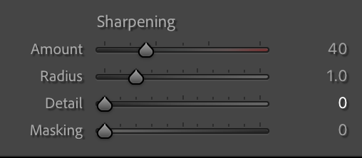
SHARPENING:
The rule is to do the minimal sharpening at this point if you plan to print the image large. It is better to scale the image to print size and review a test print at scale than sharpen. If you’re doing small prints or low-res web images, you can crank up the sharpening here.
What about the “Enhanced” feature in LR or the AI-based enhancement tools? To date, from our testing both from high-res film scans or high-quality digital camera files, these tools create as many problems as they solve. We have found them to be pretty amazing at taking a low res image say a 1.5 MP file from an early digital camera and creating an interpretive image that has virtual, let’s just call it what it is, fake details. Our conclusion is to save AI enhancements for after you have reviewed a test at scale.
Following the suggestions above should produce a very natural/real-looking image. I recommend creating a virtual copy so you have the comparison, then use LR to get the color, contrast, mood effects, etc. that you like with all the filters or effects that define your style. I’m more comfortable in PhotoShop (PS), so I use curves, hue/sat, and unsharp masking as layers, often with masks to control local adjustments, but you can do all of this in LR.
For scaling, we use Gigapixel AI. But its results need to be reviewed. It does some things nicely, but can also cause problems like clipping the shadows, or creating uneven effects! Using Photoshop scaling and unsharp masking is safer to get to the scale you desire and is more predictable.